 |
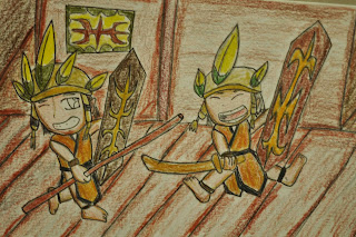
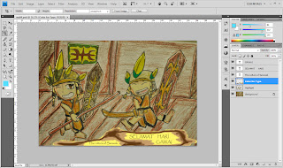
| This is my initial pic.The picture is drawn using a color pencil and drawing pen(traditional). It's a snapshot using a camera. |
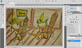 |
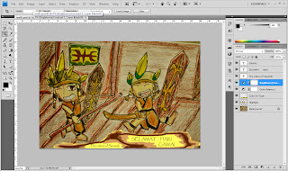
| Here I did a little bit of colors on the image using Photoshop. The tools for using the colors is the "Soft Brush Tool". The brush size can be adjusted using [=(increase) and ]= (decrease). Notice the change of the eyes at the cartoon at the right. |
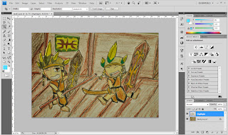 |
| Next was a new layer for "Highlight". I'm still using the brush tool for the highlights. After using the brush tool I used the "Blur Tool" to blend what I highlighted. By doing this, the picture seems more enhanced (well, maybe) |
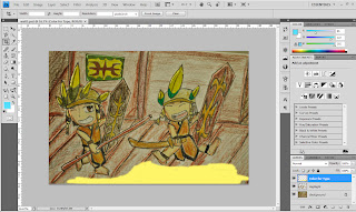 |
| Next was a new layer. Again, I use the brush tool, but this time it's for the type play. I paint it Yellowish-Brown for the typography that I want to make. |
 |
| There is the typography. I used "Type Tool" and used the Papyrus font to type the words. I used Ctrl+T to adjust the font size. |
 |
| Next was a little adjustment on the image. I used the adjustment menu and used both Brightness/Contrast and Color Balance to make the image more earthy, contrast and brownish. |
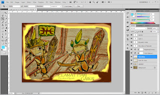 |
| Sorry to say this, but I'm not really satisfied by the previous work. So I did some correction using the brush tool (again...) to make a new space for the typography. I moved the typo "the culture of Sarawak" closer to the other typo to "unite" the type play. also added the foreground frame (again using brush tool....) |
If I need any improvements or upgrade my file please help me.


